Well, time to do assignment.
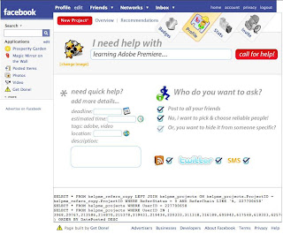
Let's go through each of the screenshoot
Good thing first, the upper menu looks quite nice in term of aesthetics.
But why are you in profile? And the homepage is loaded with too many options: privacy (all friends, white-list some specific ones, black-list some), method to send the help (RSS, Twitter, SMS), and more detailed help!
- Privacy options are too verbose, it can be done better by some icons to demonstrate the meaning. When the user hover over the icon, he can read the detailed description of these options
- Twitter and sms are very unnecessary and extra options, shouldn't be shown to user directly like this.
- Detailed request should be put as an optional link (like google calendar) in the main, short request bar above.
So most of the parts of the home page are not very functional.
The homepage is the page users see whenever visiting the app, and most likely the only page users see, so we want to be sure it loads with the most important information, the information that define the app. Here it is help requests: your own requests (of course you want to know the response / progress the most right?) and friends' request (if it's pump into your face that your friends need help, you will pay more attention!). So these requests should be shown in the home page!
That's the overview page! They should've combined the two pages. (That's what facebook does: show you your friends' newest feed in the homepage, yet allow you to write new status in the same page)
Quick comment on two other pages. Will come back with more detailed comments.
This page look the best so far. The wall / chat room is nice. The 3 icons (refer friends, help and wish luck) looks attractive. Thats good.
I dont understand the bar on the right though. 1 is helpers: 9 souls have offered their hand. Soul? it doesn't sound fun! kind of revered thing? and why are the icons repeated (lol)
Probables is kind of complicated words, should choose a simpler one. Hmm, chances doesn't seem right. But the upper one called helpers, why doesn't this one called referees? friends referred?

Statistics page looks good, but it should show something more encouraging to the users first, like his own statistic and achievement, badges, etc.


